Hi all,
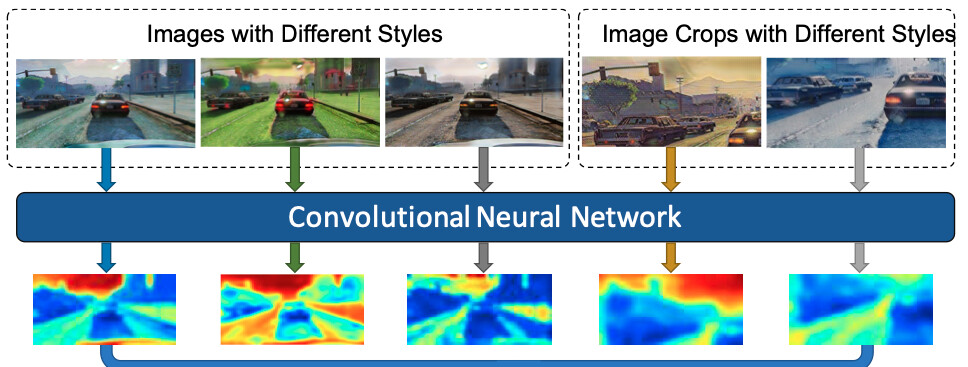
May I ask for help in regards to how to extract and plot heatmaps for features like the one shown in the image included in this post?
Thank you ![]()
Hi all,
May I ask for help in regards to how to extract and plot heatmaps for features like the one shown in the image included in this post?
Thank you ![]()
convert your tensor to Numpy first using .detach().cpu().numpy()
And use matplotlib imshow with cmap argument. I think in the case you sent it’s cmap=‘jet’
@nitaifingerhut Hi Thanks for your reply. Do you know if any pre-processing step is usually applied to these features before plotting them? In many research papers, I only see them visualising one feature map where in practice we often have few hundred (32, 64, 128 or even 256) of these features in one layer.
well it depends on what you want to plot…
I think you are referring to papers which visualize the network learnable parameters, and the plots aims to make sense in what your model is learning.
In other cases you may only plot the model’s output to understand how it is doing in relate to ground truth / whatever you are trying it will learn.
I am trying to understand like what exactly the network is “seeing” when it is predicting a car or a sky, etc…
You are searching for saliency map which is the color map image that involves most feature when the prediction is happening.
You can refer this link for these.
you need to provide a wider context of your data, model and objective and explain exactly what you want to see
nevertheless, the way to plot tensors is as I mentioned, by converting to numpy and plotting it
Thank you for the suggestion! I will look into it 
I am working on a stereo matching network and I want to visualise the differences in features extracted in different network architectures. I am hoping by visualising these features from different networks will help me to understand the pros and cons provided by each network.
I hope this make sense