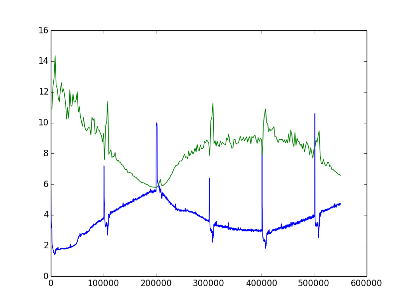
This is a language model based on transformer architecture. It is extremely imbalanced data, but still I have no idea how to interprete this and what to do next.
First guess is the learning rate and scheduler. For this, I used Adam (learning rate: 0.00025 and cosine scheduler). I thought the first phase of train loss increase was due to the imbalanced data, but that should be applied same to the validation data. The suddens peaks occur at the very beginning of epochs. I can’t explain why that happens too.