Hi friends,
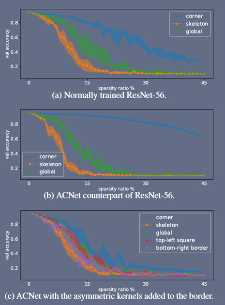
I have read a paper named " ACNet: Strengthening the Kernel Skeletons for Powerful CNN via Asymmetric Convolution Blocks". Is there anyone have idea how this picture drawn? Like each curve with different colors in different painting palette? Sorry I don’t know how to describe this but looks fancy, and wanna get some ideas how to plot similar to this style.
1 Like
try fill_between in Matplotlib