Take a look at this blog post, which compares different libraries and their kernel density estimation functions and might be a good starter.
Many thanks for your help. I need to show histogram with the line format and in the case that it would be possible for me to change the number of bins, but the histogram be in the line format. I have this histogram with np.Histogram, but I need to have it in the line format, please forget kernel density .
I am using this code and fake is 64*1x11x11x11 (64 is batch and 11x11x11 is the number of patches in 3D)
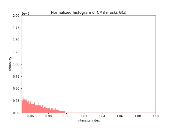
FFBins1=[]
for jj1 in np.arange(0,1.3,0.0000001):
     FFBins1.append(jj1)
        hist_r = np.histogram(fake.cpu().squeeze(1).view(-1).detach().numpy(), bins=FFBins1,range=[0 ,1.3])
        count_r = hist_r[0]
        # Plot manual
        bins1 = hist_r[1]
        fig = plt.figure()
        plt.figure(figsize=(8,6))
        PP=count_r/(count_r.sum())

plt.plot(bins1[:-1],PP, color='r', alpha=0.5)I don’t know what the line format is. Could you explain it a bit or link to a known implementation?
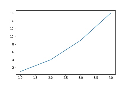
Like this graph that I plot with Matplotlib for defined x and y. I need to have this line format for the histogram without smoothing and just adjust it with the number of the bins. I used plt.plot in my last code but I don’t undrestand why it is not in the line shape?
plt.close("all")
plt.plot([1, 2, 3, 4], [1, 4, 9, 16])
Your code works fine for me using random inputs:
fake = np.random.randn(100)
hist_r = np.histogram(fake, bins=10)
count_r = hist_r[0]
# Plot manual
bins1 = hist_r[1]
fig = plt.figure()
plt.figure(figsize=(8,6))
PP=count_r/(count_r.sum())

plt.plot(bins1[:-1],PP, color='r', alpha=0.5)
Did I pass the fake correctly it is 64x1x11x11x11 data?maybe I pass it incorrectly
I check it again by random value works but by my data show discrete not lines
I would try to zoom in and verify that it’s indeed discrete and not just a visualization issue.
Yes my eyes is getting weak 
The problem was the number of bins, they are very high , because of that it shows wrong
Many Thanks for your help
Sorry, I am very curious to know if i want to use “Seaborn” package from this link:
https://seaborn.pydata.org/tutorial/distributions.html
what is (x=“flipper_length_mm”) in my case for example here:
fake=penguins, but what will be my x? I think x is a data it is not a label of the axis.
sns.displot(penguins, x="flipper_length_mm", kind="kde", bw_adjust=.25)
I guess the penguins data is a pd.DataFrame, with different column names, which can be directly used in seaborn. You could execute the tutorial step by step and check the loaded data etc.
1 Like