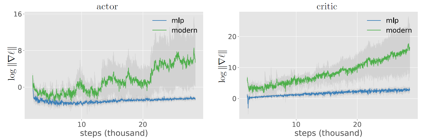
the authors (Bjorck et al. 2021) of the paper “Towards Deeper Deep Reinforcement Learning” share a plot (Figure 3) showing the gradient of the actor and the critic loss (SAC).
I’ve got no idea how this plots was achieved, because the gradient of the loss is 1.0 after calling backward() (e.g. loss.grad). Do you guys have any idea on what’s behind this plot? Is it simply tracking the magnitude of the last layer? Or is it likely that the mean of the magnitude of all layers are visualized?
Unfortunately I could not find a proper way to contact the author himself. However, I created an issue of an unrelated repository of the first author.
I don’t think these plots show the loss gradient, but might show the (accumulated) gradients of all parameters.
From the paper:
Results averaged over five runs are shownin Figure 3. The losses initially start on the same scale, but the modern network later has losses thatincrease dramatically — suggesting that overfitting is not the issue.
This part refers the two top plots. Further:
To probe this,we simply plot the scale of the gradients for the critic and actor networks and see that they indeed aremuch larger for the large modern networks. Furthermore, the gradient magnitude increases duringtraining and shows large spikes, especially for the actor.
Here it seems that the two bottom figures are “plotting the scale of the gradients”, so I don’t believe it’s the loss gradient necessarily.
Bottom left &right.The gradient of the actor and critic during training. For the deeper network, training becomesunstable with occasional spikes and large and growing gradients.