Hi, how would I go about visualising the result of pytorch.stft similiar to scipy?
I don’t entirely understand how can I use that output to achieve a similiar plot:
Could you post a reference plot and highlight the difference?
Based on your current output, it seems you might have some high outliers, which could squeeze the color map and thus result in a “dark” image.
If that’s the case, you could torch.clamp the output before feeding it to matplotlib.
1 Like
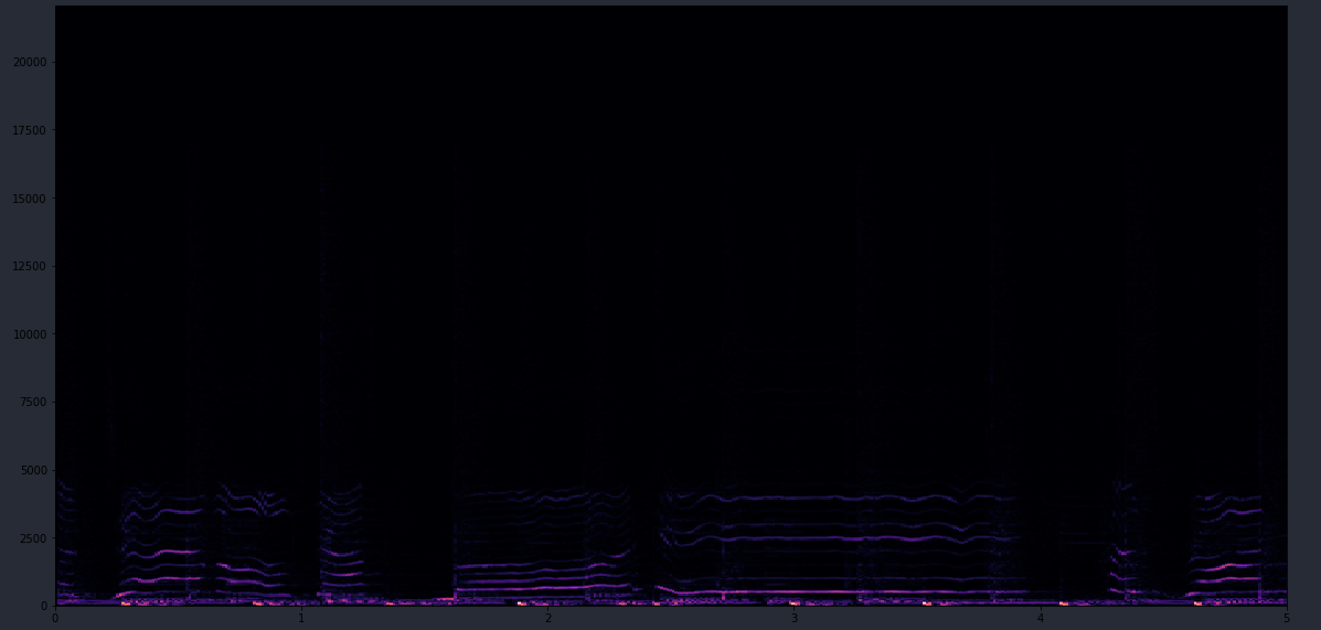
Perhaps I wasn’t clear - I’m just not sure how to use the output of pytorch.stft to get any plot. Could you please provide an example?
Ah OK, sure.
Adapting the scipy example:
fs = 10e3
N = 1e5
amp = 2 * np.sqrt(2)
noise_power = 0.01 * fs / 2
time = np.arange(N) / float(fs)
mod = 500*np.cos(2*np.pi*0.25*time)
carrier = amp * np.sin(2*np.pi*3e3*time + mod)
noise = np.random.normal(scale=np.sqrt(noise_power),
                         size=time.shape)
noise *= np.exp(-time/5)
x = carrier + noise

x = torch.from_numpy(x)
x = x.unsqueeze(0) # add batch dim


out = torch.stft(x, n_fft=1000)
out_real = out[:, :, :, 0]
out_imag = out[:, :, :, 1]

out_abs = torch.sqrt(out_real**2 + out_imag**2)

plt.pcolormesh(out_abs[0])
2 Likes