Plt.show and plt.plot difference in heatmap?

Hello

I have heatmap result as below
화면 캡처 2021-06-03 174133

landmark_heatmap.shape is (600,480)

left pic is
plt.imshow(landmark_heatmap.detach().numpy())
right pic is
plt.plot(landmark_heatmap.detach().numpy())

why is it? can I change axis of plot? it dosent mention about it on doc…

also, I wonder if I can make gaussian fit to heatmap…to get confident

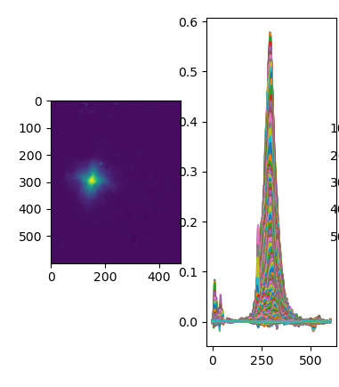
plt.imshow is used to visualize image-like arrays and will plot the pixel intensity for each pixel location using a colormap (or would directly use the colors in case the image has 3 channels), while plt.plot would visualize each “row” of the input array as a new line and would use the pixel intensities as the y-value.