Hy guys i don’t understand why i have this kind of graphic, why i have these up and down in the training curve? My LR = 0.00000001 and WD = 0.00001, as optimizer i use Adam.
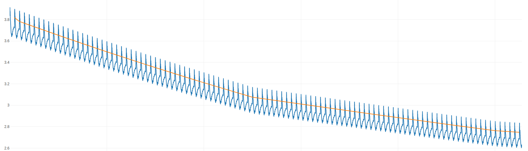
Is the plot showing the training loss for each iteration and are the peaks at the end of each epoch?
If so, are you shuffling the data?
In the dataloader i don’t suffle the data!
This could explain the peaks, as some samples might be harder to classify than others.
If you shuffle the dataset, this cyclic behavior should disappear.
1 Like
Oh yes, i didn’t think about this. i’ve forgotten this thing. Thanks a lot.