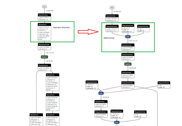
I have set some qconfig for a model and want to check whether I insert the fake quant in right place or not.
If possible to visualize the quantized model like the ONNX model?
Right now we don’t have a visualization tool.
- for eager mode quantization it is expected that user needs to reason about the model and make sure fake quant are inserted correctly when they place QuantStub/DeQuantStub around the model
- for fx graph mode quantization, fake quant will be inserted correctly based on qconfig settings (QConfigMapping), and you can print the model graph (print(prepared_model.graph)) to see where they are
You can try also the package torchview, which provides several features (useful especially for large models). For instance you can set the display depth (depth in nested hierarchy of moduls).
Note: The accepted format for tool is pytorch model, which would be fine if you can extract pytorch model from onnx format
Disclaimer: I am the author of the package
Hi @jerryzh168, thanks for your reply. I think the visualization tool is quite important for the user ![]() . Does the team have plans to add this feature?
. Does the team have plans to add this feature?
Please make visualization tool for fake quantization and converted result.
It’s important to check the actual computational graph is changed from fake quantization to quantized matrix multiplication.
is this a general visualization for pytorch models? please feel free to request this feature in general pytorch, e.g. by opening issues: Issues · pytorch/pytorch · GitHub
