I am training a network on mnist dataset. I wonder how I could possibly visualize the class distribution like the image below.
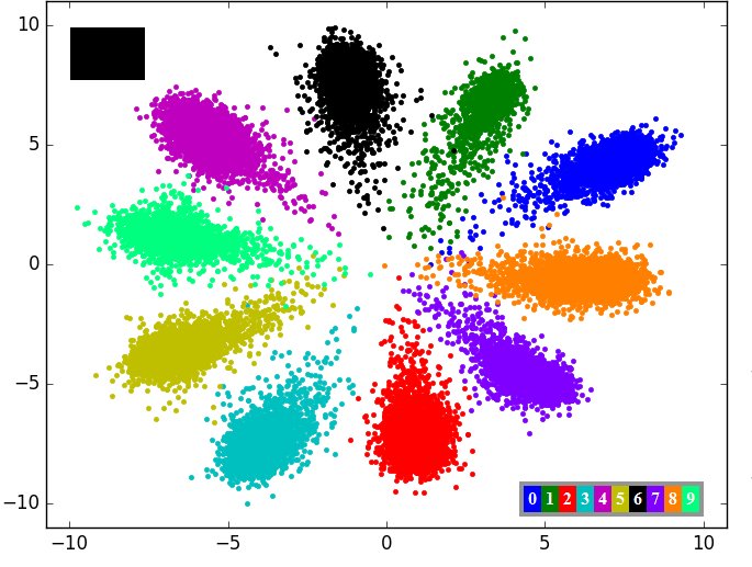
You may use either t-sne,PCA to visualize each image. But the visualization bit more different than your image. As it depends on what network you are training for MNIST dataset. If you train an autoencoder then pass the dataset to get the latent vectors then plot then you might see bit more structure.
PFB link for generic visualization of MNIST
Thanks for the link. I wonder in which layer’s output of the model, tnse or pca should be applied to represent the decision boundaries of the model.
If you are using VGG or any classifier you can take any layer after the avgpool I guess or flatten the input image 28*28 to 784.
In this case, I wonder what would be the iterpretation of logit layer in 2D embedding? Shouldn’t be the last hidden feature layer?
you can think it of anyway depends on which features you want to visualize. usually people do visualization of data (28*28=784) before the training to understand how they are distributed and in the case of autoencoder they visualize after and before the training to know how the latent space was changed after the training.
Thanks for the illustration.
Is it possible to train the center points of those areas in tsne representations, in the sense that some number of center points equal to the number of classes is hard coded and then train the classifier to collect the sample from each class around the corresponding center point?
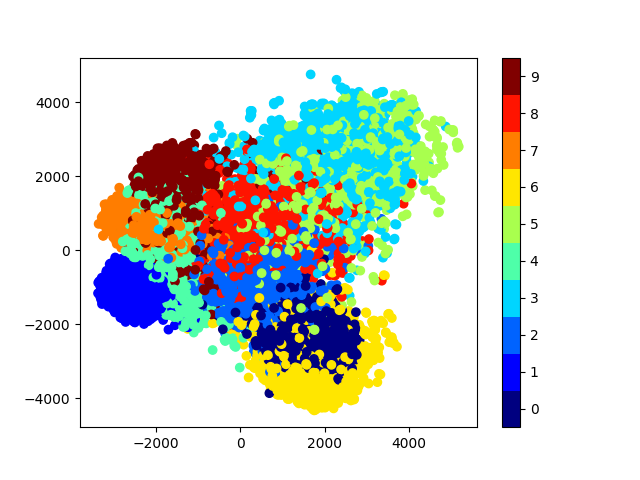
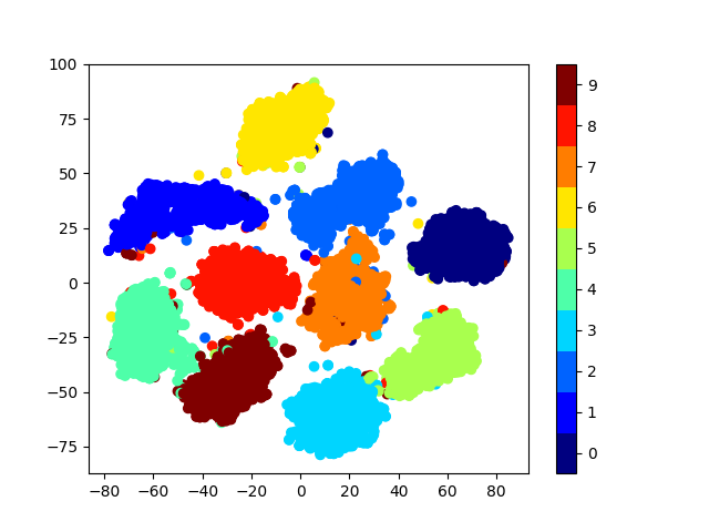
When I use tsne with different parameters, I get completely different plots.
For example for
model_tsne = TSNE(n_components=2, random_state=0)
and
model_tsne = TSNE(perplexity=30, n_components=2, init='pca', n_iter=5000)
I get the plots below:
@silvester Hi, were you able to visualise the distribution as the original image you showed?
Is there a way to visualize the decision boundaries?