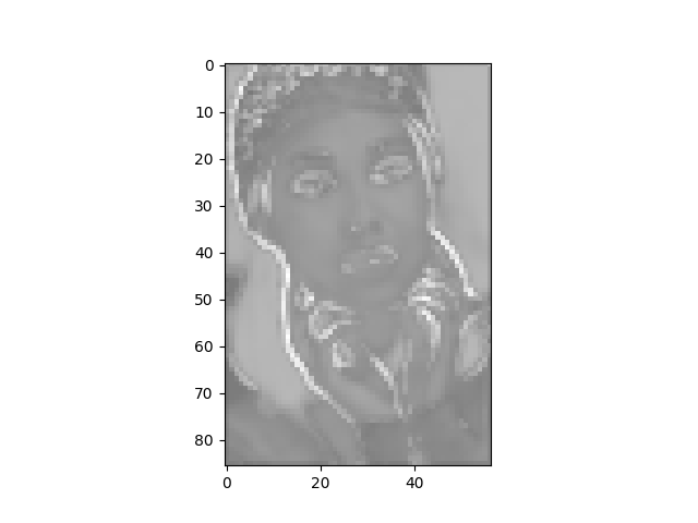
Does anyone know why my code is visualizing feature map in grayscale when I’m using it during forward-pass? I want to visualize it in other colors
def vis_tensor(data):
    data  =data.data.cpu().numpy()
    data =data[0].transpose((1, 2, 0))
    data = data - data.min()
    data = data / data.max()
    data = data * 255
    mean = np.repeat(data.mean(-1, keepdims=True),3 ,2)
    mean = mean.astype('uint8')
    pylab.imshow(mean)
    pylab.savefig('mean.png')
    max = np.repeat(data.max(-1, keepdims=True), 3, 2)
    max = max.astype('uint8')
    pylab.imshow(max)
    pylab.savefig('max.png')
Output now is like this: