If you’d like some background on the ridiculous project I’m working on, see here, here, and here, but I’ll give the basics below to save you the time… ![]()
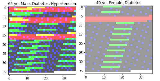
Using BCELoss with a final sigmoid activation, I’ve trained a vanilla CNN to produce a vector of likelihoods for 4 category labels given an input image. My label targets are length 4 multi hot vectors, e.g. [1, 0, 1, 0]. My input images are produced from tabular data (12 binary columns indicating presence or absence of an attribute for an individual + that individual’s age) by creating a pixel (dtype=float) for every unique three length permutation of column values and then setting the alpha channel for every pixel = age/100. They look something like this:
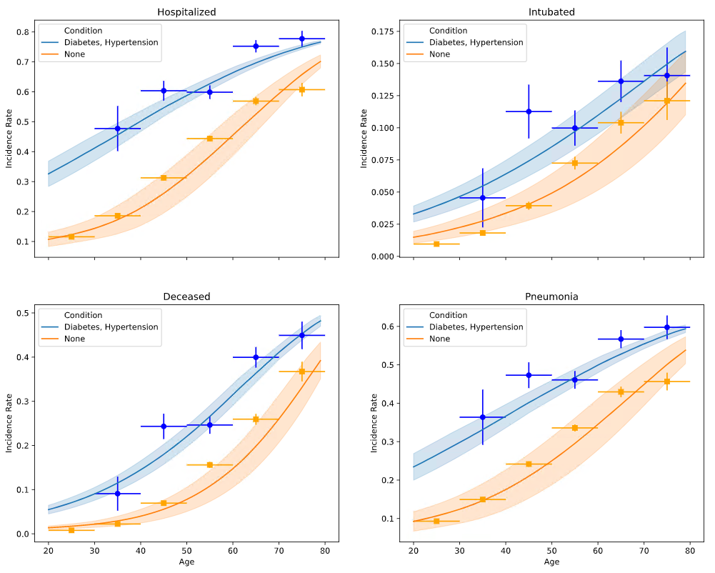
After training, my inference results seem to pass the smell test. The likelihoods at least seem directionally accurate (e.g. an individual’s risks increase with age and number of preconditions).
Patient:
36 yo, Female, Tobacco Use
Predicted Label Likelihoods:
['14.41% Hospitalized', '2.05% Intubated', '1.19% Deceased', '10.99% Pneumonia']
Actual Labels:
['none']

Patient:
54 yo, Male, Diabetes, Obesity
Predicted Label Likelihoods:
['59.34% Hospitalized', '14.47% Intubated', '26.84% Deceased', '46.73% Pneumonia']
Actual Labels:
['none']

Patient:
45 yo, Female
Predicted Label Likelihoods:
['20.25% Hospitalized', '3.38% Intubated', '2.51% Deceased', '15.03% Pneumonia']
Actual Labels:
['none']
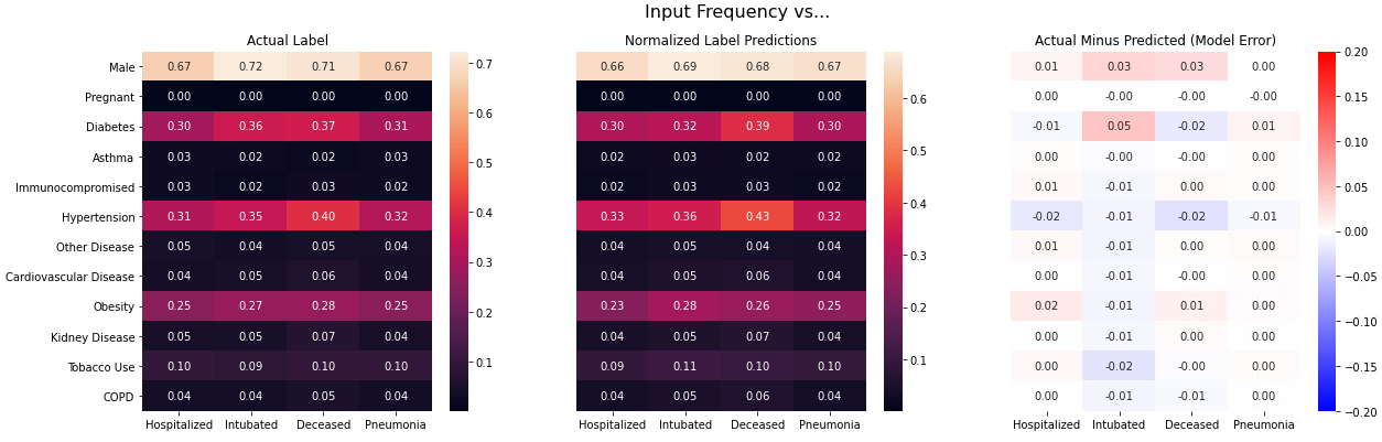
With my “smell test” looking promising, I wanted to find a way to visualize model performance across my entire validation set, so I decided to ‘back-predict’ an age distribution for the individuals in each label category using my model and then plot those predicted distributions against the actuals. There were a number of steps required to create both the predicted and actual distributions, but here are the key details:
- The predicted count of individuals with a given label for a given age was calculated to be the sum of the predicted likelihoods for that label for each sample with that age in the validation dataset.
- The actual count was calculated the same way using the target vector
Here’s the result of that effort for two different training runs with the same underlying model structure for two different optimizers, one that used the SGD optimizer with p=0.9 and one that used Adam:
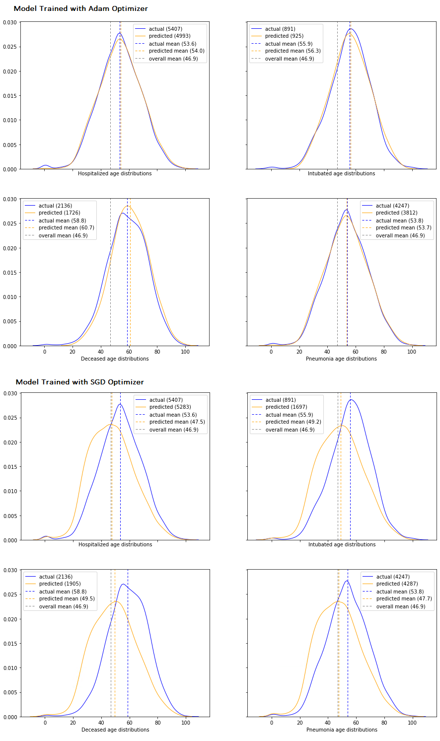
My image squished a bit, but the top 4 plots are for a model trained with Adam, and the bottom 4 are for an equivalent model (everything was the same except the optimizer) that was trained with SGD. So now (finally :)) my questions:
- I think it’s clear that the fit of the predicted vs. actual age distributions is telling me something, but what exactly? I can imagine a model that actually performs terrible during inference that nevertheless produces an exact replica of the actual age distribution. E.g. the model could predict a likelihood of 0.0001 for every even sample and 0.9999 for every odd sample and the actual labels could be 1 for every even and 0 for every odd. My distributions would still match, but my predictions would be exactly the opposite of what they should be. With that in mind, can I make any statements at all about the overall accuracy of my model based on these results?
- A match that’s too good might actually indicate overfitting rather than superior performance. If the distributions match extremely closely, should I be pleased or worried? In other words, would an ideal result be an exact match or would some slight deviations be preferable?
- Given my odd use case, I came to the conclusion that it would be counterproductive to apply any transforms to my training images. Should I still consider transforms (e.g. rotations, crops, zooming in/out, etc.) even though my images are just “calculated” directly from concrete raw data? Should I think about overfitting differently as well?
- Adam appears to be a far superior optimizer for my use case. Is that just generally true (i.e. that Adam outperforms SGD) or is it possible to look for certain underlying conditions in a dataset to determine ahead of time that Adam would be the better choice?
- Does anyone have suggestions for existing libraries that might have useful validation tools given my oddball use case?
Thoughts appreciated…